Featured Projects:
Business Intelligence & Dashboarding

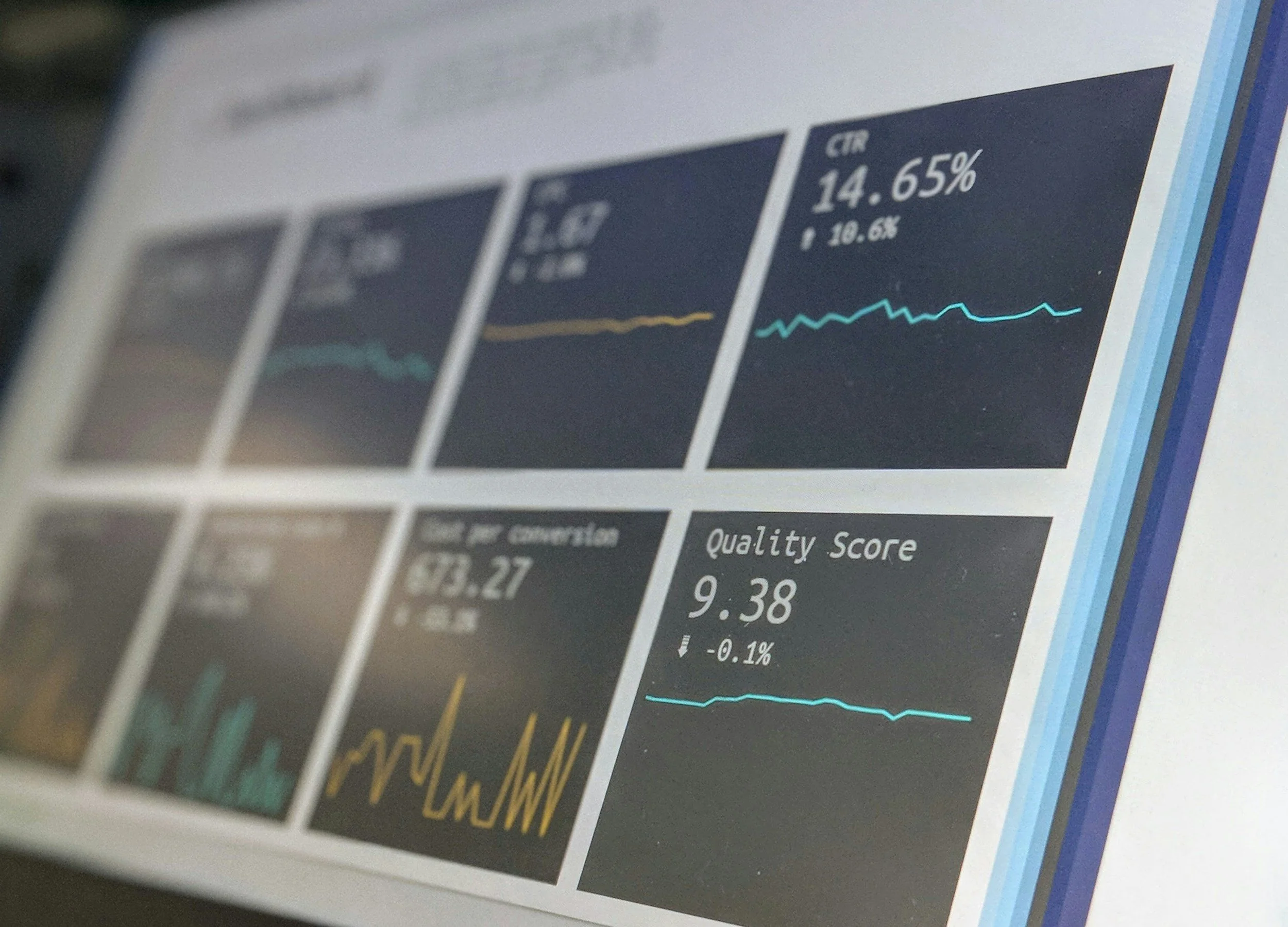
KMS Superstore – Retail Sales Optimization
Business Intelligence | Data Modeling | Retail Insights
Overview
KMS Superstore is a growing retail chain facing challenges with declining sales visibility, inconsistent reporting, and limited insight into product and regional performance.
This project modernized their analytics by building a fully interactive Power BI dashboard that consolidates sales, inventory, and customer data into a single source of truth.
Business Problem
The organization had:
No centralized reporting system
Limited visibility across store locations
Difficulty identifying profitable products or regions
Manual Excel reports causing delays in decision-making
No KPI standards for revenue, profit, or inventory health
Business Questions
Leadership needed a dashboard that could answer:
“What product categories drive revenue?”
“Which regions underperform, and why?”
“Where should we adjust inventory and pricing?”
“What are our overall profitability trends?”
Project Goals
Build a dynamic Power BI dashboard for sales optimization
Modernize the data model using Star Schema
Identify key patterns in revenue, customers, and products
Provide recommendations for price adjustments and stock planning
Create scalable KPI tracking for leadership
Tools & Methods
Power BI (Data modeling, DAX, Visualization)
Power Query (Data cleaning, transformations)
DAX Measures (KPIs, time intelligence, custom calculations)
Star Schema (Fact table + Dimension tables)
Excel / CSV (Raw data sources)
Data Preparation
Cleaned and standardized product, category, and region names
Removed duplicate entries & fixed missing values
Built a fact_sales table containing all transaction-level data
Created dimension tables for:
Product
Customer
Region
Date
Established relationships to enable efficient slicing/filtering
Dashboard Features
Your dashboard includes:
1. Executive Summary
Total Sales
Total Profit
Average Discount
YoY performance trends
Profit contribution by category
2. Product Performance View
Best and worst-performing products
Category and subcategory insights
Profit vs. quantity breakdowns
High-discount low-profit items flagged
3. Regional Insights
Sales by region and store location
Store-level performance ranking
Geo-mapped insights
Regional profitability trends
4. Customer Insights
Top customer segments and purchasing behavior
Frequency and transaction volume
Contribution analysis
5. Trend Analysis
Monthly and quarterly revenue trends
Seasonal demand patterns
Sales forecasting (optional)
Business Impact
This dashboard enabled KMS Superstore to:
Improve pricing strategy by aligning discounts with profitability
Reallocate inventory to high-performing regions
Identify and discontinue non-profitable products
Reduce reporting time from days to minutes
Enable leadership to make data-driven decisions instantly
Project Deliverables
Fully interactive Power BI dashboard
Data cleaning & preprocessing scripts
Power BI data model (Star Schema)
KPI framework for retail performance
Executive-ready insights summary
Project Links
View Power BI Dashboard
View Tableau Dashboard
Let’s Work Together
If you’d like a similar Power BI dashboard for your business, feel free to reach out.

Bike Sale Analysis
Customer Insights | Sales Trends | Business Intelligence
Overview
This project explores the purchasing behavior, customer demographics, regional trends, and sales patterns for a fictional bike retailer. The goal was to build a clean, interactive Power BI dashboard that helps leadership understand who buys bikes, where sales are strongest, and which customer groups should be targeted for future campaigns.
Business Problem
The company needed clarity on:
Who their core customers are
How demographic factors (age, income, marital status, education) affect buying behavior
Which regions produce the highest sales
What factors most strongly influence bike purchases
Leadership had raw survey and sales data but no analytics framework for turning it into actionable insights.
Project Objectives
Build a professional Power BI dashboard for customer and sales profiling
Identify high-value customer groups
Uncover demographic and regional patterns in bike purchases
Help marketing teams tailor promotions to the right audience
Tools & Methods
Power BI
Power Query (data cleaning & transformations)
DAX (measures & KPIs)
Excel (raw dataset)
Data Preparation
Key steps included:
Cleaning inconsistent category values
Creating age groups for clearer segmentation
Reclassifying income levels
Removing duplicates
Standardizing region and marital-status values
Building relationships in the data model
The final model enabled dynamic filtering by:
Region
Gender
Marital status
Age group
Education
Children count
Income band
Dashboard Features
1. Customer Demographics Overview
Gender distribution
Age group breakdown
Income segmentation
Education level distribution
2. Purchase Behavior Analysis
Percentage of customers who bought a bike vs those who didn’t
Comparison of buying patterns across demographic groups
Indicators showing which segments are most likely to purchase
3. Regional Sales Insights
Total purchases per region
Purchase rate comparison by geography
Regional demographic differences
4. Interactive Filters
Users can explore purchase behavior by:
Gender
Marital Status
Region
Age Group
Income
Education Level
Business Impact
This dashboard helped the organization:
Identify ideal customer profiles for targeted marketing
Understand demographic gaps in current outreach
Tailor promotions to the most likely buyers
Allocate marketing spend more efficiently
Improve sales prediction based on customer characteristics
Deliverables
Interactive Power BI dashboard
Cleaned and transformed dataset
DAX measures for KPIs
Customer-centric insights summary
Project Links
View Power BI Dashboard
Read full article
Let’s Work Together
I help organizations build dashboards that tell clear stories and support strategic decisions.
Data Visualization | Business Insights | Dashboard Storytelling
Overview
This project involved creating interactive dashboards and visual storytelling from a complex dataset to uncover business trends, performance metrics, and actionable insights. The goal was to present data clearly for both technical and non-technical audiences, showcasing skills in Power BI/Tableau and business analytics.
Business Problem
The challenge required:
Presenting a large dataset in a digestible and insightful way
Identifying key patterns and trends for business stakeholders
Designing visuals that communicate findings without overwhelming the audience
Ensuring the dashboard could support decision-making
Leadership and competition judges needed clarity in metrics, trends, and actionable insights, not just raw numbers.
Project Objectives
Build an interactive, visually appealing dashboard
Highlight key performance indicators (KPIs) for business decisions
Explore data trends using charts, heatmaps, and tables
Provide recommendations based on insights
Showcase storytelling through data
Tools & Technologies
Power BI / Tableau for dashboard creation
Excel / CSV for data preparation
DAX (Power BI) for KPI calculations
Calculated Fields (Tableau) for advanced metrics
Visual Design Principles to enhance readability and impact
Data Preparation
Cleaned and standardized dataset columns and formats
Handled missing or inconsistent values
Aggregated metrics for trend and KPI analysis
Created calculated fields for derived metrics (e.g., growth %, ratios)
Structured data for smooth interactive filtering
Dashboard Features
1. Executive Summary
Total revenue, growth rate, and key KPIs
Quick-glance visuals for stakeholders
2. Trend Analysis
Time-based performance trends
Comparison of key metrics across periods
3. Segment & Category Insights
Performance by product, region, or business segment
Interactive filters for dynamic analysis
4. Visual Storytelling
Heatmaps, bar charts, line graphs, and KPI cards
Clear color coding and layout for easy interpretation
Interactive slicers to drill down into details
Business Impact
Stakeholders could quickly understand business performance at a glance
Reduced decision-making time by consolidating key metrics in one dashboard
Provided a reusable template for future data visualization projects
Demonstrated the ability to combine analytical rigor with clear storytelling
Deliverables
Fully interactive Tableau/Power BI dashboard
Cleaned dataset and prepared metrics
Executive insights summary
Storytelling-focused visuals for presentations
Project Link
View Power BI Dashboard
Let’s Work Together
I create dashboards and visualizations that transform complex data into clear, actionable business insights.
Tata Data Visualization
Data Analytics | Workforce Insights | Business Intelligence
Overview
The Maven Family Leave Challenge focused on analyzing employee leave data to uncover trends, identify gaps in coverage, and provide insights that inform HR and operational decisions. Using Power BI/Tableau and Python, the project turned complex workforce data into interactive dashboards and actionable recommendations.
Business Problem
Organizations often struggle with:
Understanding how family leave impacts workforce planning
Tracking leave by department, role, or location
Identifying trends in employee utilization of leave policies
Making data-driven decisions to improve coverage and staffing
The challenge was to create a data-driven solution to help HR and management make informed policy and staffing decisions.
Project Objectives
Clean and structure employee leave datasets
Build interactive dashboards to explore leave trends
Highlight departments or roles with high or low leave usage
Provide actionable insights for policy adjustments
Enable management to make informed staffing and operational decisions
Tools & Technologies
Power BI / Tableau for interactive dashboards
Python / Pandas for data cleaning and preprocessing
Excel / CSV for raw data management
DAX / Calculated Fields for KPIs and metrics
Visual Design Principles to enhance storytelling
Data Preparation
Key steps included:
Cleaning and standardizing employee, department, and leave type data
Handling missing or inconsistent values
Calculating leave utilization percentages and leave trends over time
Structuring data for dashboard filters by department, location, and role
Dashboard Features
1. Leave Overview
Total leave taken vs available leave
Breakdown by leave type (family, sick, vacation)
KPI cards for HR monitoring
2. Department & Role Insights
Comparison of leave usage across departments
Identification of underutilized or overutilized leave categories
Highlights trends in workforce coverage gaps
3. Time & Trend Analysis
Leave usage over months/quarters
Seasonal patterns affecting staffing and productivity
4. Interactive Features
Filters for department, location, role, and leave type
Drill-down capabilities for detailed analysis
Key Insights
Certain departments were consistently underutilizing leave, indicating potential workload stress
Seasonal spikes in leave (e.g., holidays) required temporary staffing adjustments
Leave usage patterns differed by role, highlighting opportunities for targeted policy adjustments
Data-driven dashboards enabled HR to monitor trends and improve operational planning
Business Impact
Improved workforce planning and staffing allocation
Enabled HR to adjust policies based on actual leave utilization trends
Reduced operational disruption during high-leave periods
Provided leadership with clear, actionable insights
Demonstrated the ability to translate workforce data into strategic decisions
Deliverables
Interactive Tableau / Power BI dashboards
Cleaned and structured leave datasets
KPI metrics and calculated fields for monitoring
Executive summary of leave insights and recommendations
Project Links
View Power BI Dashboard
View GitHub Repository
Let’s Work Together
I help organizations transform workforce and operational data into actionable insights, improving decision-making and employee management.